
A Comprehensive Guide on Using Tailwind CSS with React Icons to Create an Engaging Contact Page


Table of contents
Introduction
One of the most important places for customers to reach out to companies online is the contact page. Beyond mere aesthetics, a visually appealing contact page improves the user experience, establishes trust, and promotes meaningful engagement. A contact page in the ever-changing world of web design is more than simply a static form; it's a portal to significant user interactions. Users' impressions of a company or brand are frequently shaped at the contact page, which is a crucial point of interaction when navigating through websites. An attractive contact page may greatly affect user engagement and the public's perception of your business, so you must take the time to design one.
Introduction to the technologies used: Tailwind CSS and React Icons
Two robust technologies, Tailwind CSS and React Icons, are essential in our pursuit of making an aesthetically appealing contact page. The complementary qualities of each element help to ensure that form and function are well-coordinated. Let's take a quick look at these technologies and see why they work so well together to make interesting user experiences.
Tailwind CSS: Unleashing Utility-First Styling
Tailwind Regarding web development, CSS is a game-changer since it is a utility-first framework. Tailwind gives a large collection of utility classes that developers may use to compose styles directly in the HTML markup, rather than depending on pre-defined styles. The unprecedented efficiency and adaptability of this method make it possible to build cutting-edge, user-responsive interfaces in a flash. some of the key features are:
- Putting Utility First:
Tailwind is utility-first, letting developers apply styles directly. This granular approach improves agility and reduces bespoke style.
- Responsive Design Made Simple:
Tailwind makes responsive design easy. Responsive utility classes provide screen size adaptation without media queries in the framework.
- Large Component Library:
Tailwind has a large pre-built component library. With these components and utility classes, developers can focus on creating great user experiences faster.
React Icons: Dynamic Iconography in React
Many developers turn to the widely used React Icons package for easy icon integration into React apps. A wide variety of well-known font sets, including Material Design, Font Awesome, and more, are available for customization in its extensive icon library. Using React Icons, adding dynamic and aesthetically pleasing icons to your React components is a breeze. some of the key features are as follows:
- Flexible Icons:
React Icons provides developers with a variety of icon sets for different settings and design preferences.
- Simple Integration:
Adding icons to React components is easy with React Icons. Icons can be imported and used directly in React code, making apps more visually appealing.
- Customizing & Theming:
React Icons makes icon customisation and theming easy. Developers can match icon size, colour, and other styling to the design language.
Setting Up the Project
To begin, open Visual Studio Code and run the following command in the console to create a new React app. Give it the name contact form and navigate to it using the second command.
npx create-react-app contact-form
cd contact-form
Install the necessary dependencies by running the following command
npm install
Installing Tailwind CSS in a React project
Run the following command to install tailwind CSS:
npm install -D tailwindcss postcss autoprefixer
Configuring Tailwind CSS to suit project requirements
To turn the tailwind configuration file run the following command:
npx tailwindcss init -p
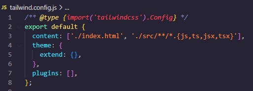
Image showing tailwind CSS configuration file
The next step is to add the paths to all of your template files into the tailwind.config.js file
'./index.html', './src/**/*.{js,ts,jsx,tsx}',
Image showing where to add the paths in tailwind.config.js
Lastly, add tailwind directives to the index.css file
@import 'tailwindcss/base';
@import 'tailwindcss/components';
@import 'tailwindcss/utilities';
Installing React Icons
Install react icons using the following command:
npm install react-icons --save
Designing the Contact Form
In the src folder, create a folder and name its components. In the components folder create a file and name it ContactPage.jsx
The following code is a contact page with classified contact information and an interactive form for user inquiries is provided by the ContactPage React component. It dynamically generates a visually pleasing grid structure with the contact details for various departments, including Careers, Delivery, and Support. The form has email and full name input fields, a drop-down menu for selecting a category, a text field for comments, and a checkbox for the terms and conditions agreement. The component, which has been styled with Tailwind CSS, has a contemporary and responsive design.
```JavaScript
import React from "react";
import { MdEmail } from "react-icons/md";
import { FaPhoneAlt, FaMessage } from "react-icons/fa";

const ContactPage = () => {
  const ContactInfo = [
    {
      title: "Delivery",
      email: "delivery@gmail.com",
      phone: "+254 780341267",
      message: "+254 789065432",
    },
    {
      title: "Support",
      email: "support@gmail.com",
      phone: "+254 765890231",
      message: "+254 756421190",
    },
    {
      title: "Careers",
      email: "careers@gmail.com",
      phone: "+254 768905413",
      message: "+254 711748900",
    },
  ];

  return (
    <div className="container mx-auto py-10">
      <div className="text-center mb-10">
        <h1 className="text-4xl font-bold">Contact Us</h1>
        <p className="mt-3 text-gray-600">
          Have questions? We're here to help!
        </p>
      </div>

      <div className="grid grid-cols-1 gap-6 md:grid-cols-3">
        {ContactInfo.map((info, index) => (
          <div
            key={index}
            className="bg-white rounded-md shadow-md p-6 text-center"
          >
            <h2 className="text-xl font-bold mb-4">{info.title}</h2>
            <div className="mb-4">
              <a
                className="flex items-center mb-2"
                href={`mailto:${info.email}`}
              >
                <MdEmail className="mr-2 text-violet-700" />
                {info.email}
              </a>
              <a className="flex items-center mb-2" href={`tel:${info.phone}`}>
                <FaPhoneAlt className="mr-2 text-violet-700" />
                {info.phone}
              </a>
              <a className="flex items-center" href={`sms:${info.message}`}>
                <FaMessage className="mr-2 text-violet-700" />
                {info.message}
              </a>
            </div>
          </div>
        ))}
      </div>

      <div className="mt-10 text-center">
        <h2 className="text-3xl font-bold">Have another question?</h2>
        <p className="mt-2 text-gray-600">Fill the form below</p>
      </div>

      <form className="mt-8 max-w-lg mx-auto">
        <div className="grid grid-cols-1 gap-6">
          <div className="flex gap-4">
            <input
              className="w-1/2 py-2 px-4 border border-gray-300 rounded-md"
              type="email"
              placeholder="E-mail"
            />
            <input
              className="w-1/2 py-2 px-4 border border-gray-300 rounded-md"
              type="text"
              placeholder="Full Name"
            />
          </div>

          <select
            className="w-full py-2 px-4 border border-gray-300 rounded-md"
            name="category"
          >
            <option value="" disabled selected>
              Please choose a category
            </option>
            <option value="delivery">Delivery</option>
            <option value="support">Support</option>
            <option value="profile">Profile</option>
            <option value="careers">Careers</option>
            <option value="another">Another category</option>
          </select>

          <textarea
            className="w-full py-2 px-4 border border-gray-300 rounded-md"
            placeholder="Write a commentary..."
          />

          <div className="flex items-center mt-4">
            <input
              className="mr-2 border border-gray-300 rounded-md"
              type="checkbox"
              id="checkbox_terms"
            />
            <label htmlFor="checkbox_terms" className="text-gray-600">
              I have read and agree with
              <a href="/terms-and-conditions" className="text-violet-700">
                {" "}
                terms & conditions
              </a>
            </label>
          </div>

          <button
            className="mt-4 bg-violet-700 text-white py-2 px-6 rounded-md"
            type="button"
          >
            Send Message
          </button>
        </div>
      </form>
    </div>
  );
};

export default ContactPage;
Enhancing User Experience with Icons
Visual Representation: The
react-iconslibrary is utilized to provide icons likeMdEmail,FaPhoneAlt, andFaMessage. Users will find it easier to recognize and comprehend the material when these symbols are used to visually represent the various sorts of contact information.Differentiation by Category: The contact information is set up in groups, such as Careers, Delivery and Support. An icon is used to represent each group, which makes it easier for users to find the information they need.
Accessibility and Readability: Icons come with text information, which makes them easy for people who use screen readers to reach. Putting icons and words together makes things look better and easier to read.
Styling for Visual Appeal: To keep the look of the contact page uniform, icons are styled with certain colours (text-violet-700). This helps with the overall look and feel of the business.
Integrating into the App
Import and return the ContactPage component in the app.js
import "./App.css";
import ContactPage from "./components/ContactPage";
export default function App() {
  return (
    <div>
      <ContactPage />
    </div>
  );
}
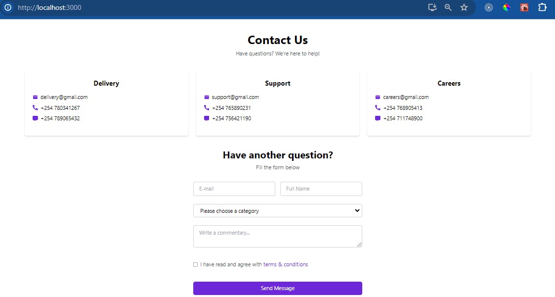
The following code will run the app in the terminal and show the contact form we just made in the browser.
npm start
An image displaying the contact form on the web browser
Animating Icons for Engagement
You can make your user interface more interesting and interactive using animated icons. Using the supplied React component for a contact page, you can add basic icon movements with Tailwind CSS. Here's a way to make animations more engaging for users:
- Hover Effects: You can add styles explicitly on hover using the hover classes provided by Tailwind CSS. Add a professional touch by combining them with transition classes. Here, the icon's size and colour will vary as you hover over it.
<MdEmail
  className="mr-2 text-violet-700
 transform transition-transform
 hover:scale-110 hover:text-violet-900 cursor-pointer"
/>;
- Apply Animation Classes: Tailwind CSS provides utility classes for various animations. You can apply these classes to your icons to create animation effects. For example, you can use the
animate-bounceclass for a bouncing effect.
<MdEmail className="mr-2 text-violet-700 animate-bounce" />
- Add Transitions: Apply transition classes to create smooth transitions for hover effects. For example, you can use the transition-transform class to smoothly transition the transform property. This will scale the icon to 110% on hover with a smooth transition.
<MdEmail
  className="mr-2 text-violet-700
transform transition-transform
hover:scale-110"
/>;
- Balancing Aesthetics: Find the sweet spot between visual appeal and user engagement by experimenting with various transition and animation classes. Pick animations that go with the aesthetic motif of your contact page while keeping the entire design in mind.
<MdEmail
  className="mr-2 text-violet-700
transform transition-transform
hover:scale-110 hover:text-violet-900"
/>;
Use these ways to bring your icons to life, making the contact page more visually appealing and engaging. Test and iterate to find the optimal animation styles for your app's design and user experience.
Optimizing for Accessibility
Web development requires accessibility to make digital material usable by all. This comprehensive guide optimizes icon and form element accessibility to meet and exceed accessibility standards. Follow these best practices to make the web more inclusive.
Icons Accessibility
Descriptive Alt Text: Always provide descriptive alternative text for icons. This ensures that users with visual impairments understand the purpose of each icon.
aria-label and aria-labelledby: For decorative icons, use
aria-hidden="true". For functional icons, employaria-labeloraria-labelledbyto provide context.
Focus on ARIA Roles
Role Attribution: Assign appropriate ARIA roles to icons, making them more interpretable by assistive technologies.
Interactive Icons: If an icon is interactive, ensure it is focusable and provides keyboard support.
Form Elements Accessibility
Use Semantic HTML: Employ semantic HTML elements such as
labelsto associate labels with form elements.Placeholders and Accessibility: While placeholders are useful, they shouldn't replace labels. Ensure that labels are programmatically associated with form controls.
Testing for Accessibility
Test with Screen Readers: Regularly test your website with popular screen readers like NVDA, JAWS, or VoiceOver to identify and address potential issues.
Keyboard Navigation: Ensure that all interactive elements, including icons and form controls, are accessible and usable via keyboard navigation.
Troubleshooting and Debugging
Building a contact page with Tailwind CSS and React icons will cause complications. Let's discuss troubleshooting and debugging basics:
Missing Styles or Classes
Make sure
Tailwind CSSandReact Iconsare installed and set up.Imported Statements: Recheck your project's import statements for both libraries.
Check your
Tailwind CSSconfiguration for mistakes and missing settings.Adjust
PurgeCSSparameters to avoid accidentally removing styles.
Browser Developer Tools
Use browser developer tools to inspect components and detect styles.
Examine computed styles to understand how styles cascade and affect components.
The
Tailwind CSS DevToolsextension provides browser-specific debugging capabilities.Interactive Mode: Interactive mode lets you test utility classes in real time.
Cross-Browser Compatibility
Find anomalies by testing your contact page on different browsers.
Vendor Prefixes: Address vendor-prefix issues for certain CSS properties that may vary across browsers.
Versions of Libraries: Check that your
React iconswork with the latest version ofReact.Make sure you're using the
React Iconscomponents correctly in your JSX by checking their usage.
Optimizing Styles
Maximize the efficiency of your build process by adjusting PurgeCSS to delete unnecessary styles.
Prioritize the loading of vital styles to speed up the initial page rendering in critical
CSS.Use
cache-busting techniquesonCSSfiles to ensure users always see the most recent styles.Versioning Your Libraries: To Take Advantage of Performance and Bug Fix Updates, Always Use the Most Recent Versions of Your Libraries.
Conclusion
The focus is on accessibility optimization when creating an interesting contact page with Tailwind CSS and React Icons. The use of accessible icons and form elements must be strictly enforced. You may ensure a smooth and accessible user experience by using ARIA properties that are made expressly for screen readers. Your contact page will be both aesthetically pleasing and usable for all users, regardless of their skills, thanks to thorough testing of accessibility elements and subsequent improvements. The significance of making user-friendly and accessible web content is shown by this dedication to accessibility.