A Comprehensive Guide on Using Tailwind CSS with React Icons to Create an Engaging Contact Page

As a full-stack web developer and technical writer, I bring a unique combination of skills to every project I work on. With experience in both web development and technical writing, I can develop custom solutions that are not only high-performing and user-friendly but also well-documented and easy to maintain. I have expertise in a wide range of programming languages and technologies, including HTML, CSS, JavaScript, React, Node.js, Python, and SQL, as well as technical writing tools and techniques. I am committed to delivering projects on time and within budget while ensuring that the final product meets the unique needs of the client. Let's work together to create something amazing that meets your needs and exceeds your expectations.
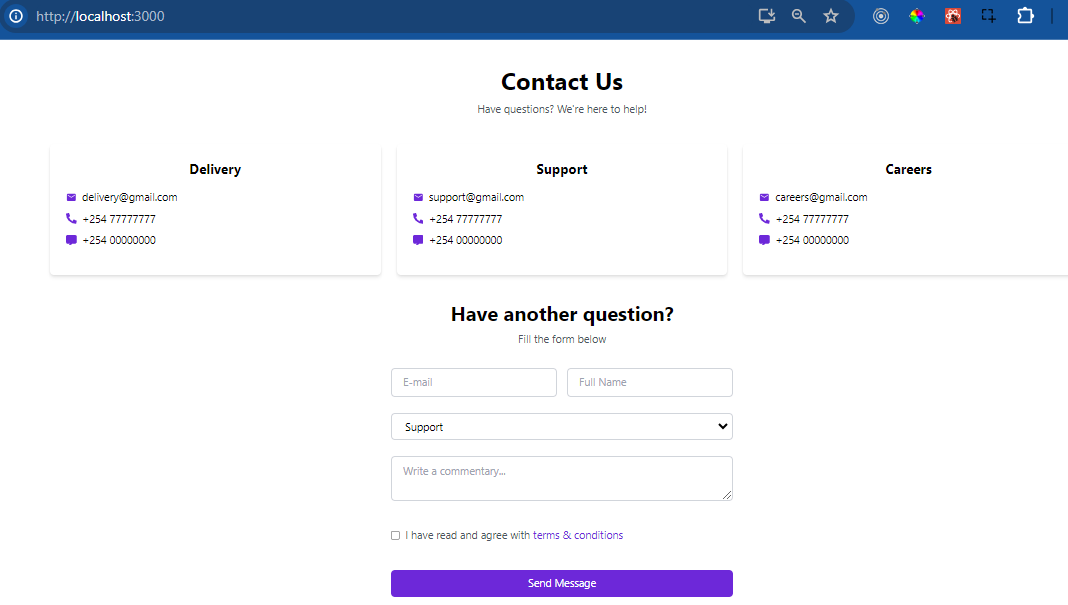
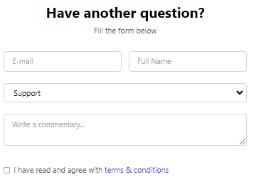
Building strong relationships between companies and their customers relies heavily on web developers creating captivating contact pages. These pages not only improve the user experience but also strengthen credibility and promote interaction. A visually appealing contact page is key. It is both visually appealing and functional. We will delve into a detailed tutorial on how to make a captivating contact page with Tailwind CSS and React Icons. Following these detailed steps, you will be able to make your site fully responsive and accessible on any device. The GitHub repository for the project can be found here. Here is a preview of the contact page we are going to create to give you an idea of what it will look like:
Prerequisites for crafting an engaging contact page with Tailwind CSS and React Icons include:
A basic understanding of React and JavaScript
Basic understanding of Tailwind CSS for styling components
An understanding of HTML and CSS for structuring and styling web pages
Optionally, familiarity with React Icons library for incorporating iconography into the project
Create a React app
Open the terminal and run the following command:
npx create-react-app contact-form
Navigate to the project directory:
cd contact-form
Install Tailwind CSS
While inside the projects directory, run the following commands to install Tailwind CSS and React Icons:
npm install -D tailwindcss postcss autoprefixer
Designing the Basic Contact Form
Create components folder in the src folder. inside components folder create ContactPage.js file.
Now, we will dissect our ContactPage component step by step. First, we start by importing icon components for email, phone, and messaging functionalities from external libraries in the React icons library. We will use these icons to enhance the visual representation of contact information.
import React from 'react';
import { MdEmail } from 'react-icons/md';
import { FaPhoneAlt } from 'react-icons/fa';
import { FaMessage } from 'react-icons/fa6';
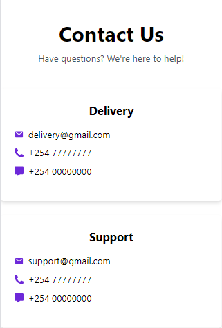
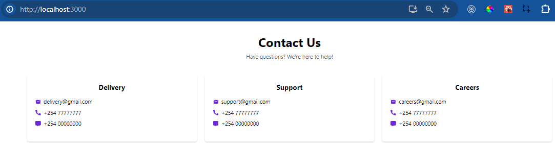
The ContactPage function contains an array of objects. They represent contact information for different categories, such as delivery, support, and careers. Each object includes properties like email, phone number, and message number.
const ContactPage = () => {
  const ContactInfo = [
    {
      title: "Delivery",
      email: "delivery@gmail.com",
      phone: "+254 780341267",
      message: "+254 789065432",
    },
    {
      title: "Support",
      email: "support@gmail.com",
      phone: "+254 765890231",
      message: "+254 756421190",
    },
    {
      title: "Careers",
      email: "careers@gmail.com",
      phone: "+254 768905413",
      message: "+254 711748900",
    },
  ];
};
Our ContactPage component also contains a drop-down menu with selectable options. The first option serves as a placeholder with no value. It prompts users to select a category. Subsequent options represent specific categories with corresponding values.
<option value="" disabled selected>
    Please choose a category
  </option>
  <option value="delivery">Delivery</option>
  <option value="support">Support</option>
  <option value="profile">Profile</option>
  <option value="careers">Careers</option>
  <option value="another">Another category</option>

Detailing Enhancements
- Improved Visual Appeal
We're including visually appealing elements such as rounded containers, shadow effects, and consistent spacing. We'll use utility classes from Tailwind CSS such as bg-white, rounded-md, shadow-md, p-6. These enhancements aim to create an aesthetically pleasing layout. We want to make it more inviting for users to engage with the content.
- Responsive Layout
We use CSS grid grid grid-cols-1 gap-6 md:grid-cols-3. It adaptively arranges contact information cards based on the screen size. This ensures a seamless viewing experience across different devices. It also enhances accessibility and usability.
On small screens:
On larger screens:
- Interactive Elements
Interactive elements such as hover effects hover:scale-110 make the icons scale up when hovered over. Colour changes hover:text-green-900 change the icon colour to green when hovered over. These enhancements make the contact page more engaging and interactive. They encourage users to explore and interact with the content.

- Accessible Form
We are styling form elements (input, select, textarea, and checkbox) using Tailwind CSS utility classes. This will give them a consistent border, padding, and rounded corners. The classes we are using are w-full py-2 px-4 border border-gray-300 rounded-md. Additionally, we will include proper labelling (placeholder attributes), validation (required attribute), and accessibility features (label for the checkbox). This will ensure that the form is accessible and usable for all users, including those with disabilities.
- Clear Call to Action
The "Send Message" button stands out with a vibrant violet background colour and white text. This makes it visually distinct and prompts users to take action. This enhancement helps guide users towards completing the desired action. It improves user engagement and conversion rates.

Integrating React Icons
React Icons is a popular package. It contains a set of customisable, scalable icons for React apps. It provides a diverse choice of icon sets, including Material Design, Font Awesome, and others.
To integrate React Icons into your project, follow these steps:
- We begin by installing the React Icons library using npm or yarn:
npm install react-icons
yarn add react-icons
- Next, import the desired icon components from the library and use them within your component code. For example:
import { MdEmail } from 'react-icons/md';
import { FaPhoneAlt } from 'react-icons/fa';
import { FaMessage } from 'react-icons/fa6';
- We use Tailwind CSS classes to customize the styles of the icons. For example, to change the colour of an icon and add hover effects, add Tailwind CSS classes directly to the icon component:
<MdEmail
  className="mr-2 text-violet-700
  transform transition-transform hover
  :scale-110 hover:text-green-900"
/>;
Conclusion
This post addressed the basic approaches for developing an attractive contact page with Tailwind CSS and React Icons. Key features include incorporating React Icons into a React project. Also, changing icon styles with Tailwind CSS classes. Lastly, developers can improve user interaction with hover effects. Developers can employ these strategies to create visually appealing and user-friendly contact pages. These pages will improve the overall user experience on their websites. By employing these tactics, developers can successfully interact with their target audience and encourage meaningful participation.


