

Table of contents
Introduction
We will learn how to develop a tag input system in React JS by following the instructions in this article! Building a tag input system is an excellent project that will help you hone your abilities in state management, processing user input, and rendering dynamic components. If you are starting with React or are seeking to improve your expertise, this project is an excellent choice.
What is a tag input system?
A tag input system is a user interface component that allows users to input and manage tags. Tags are small, keyword-like labels that provide a convenient way to categorise and organise information. Building a tag input system in React will not only give you hands-on experience with fundamental React concepts but also provide a practical and reusable component for your future projects.
What You'll Learn
This tutorial will show you how to build a tag input system from the ground up. You will gain knowledge of fundamental validation, state management, user input, and dynamic component rendering. Upon completion, you will possess an entirely operational tag input system that can be seamlessly incorporated into your React applications.
Prerequisites
Before diving in, make sure you have a basic understanding of React fundamentals, including components, states, and event handling. If you're new to React, consider going through the official React documentation or introductory tutorials to get a solid foundation.
Step 1: Set up your React project
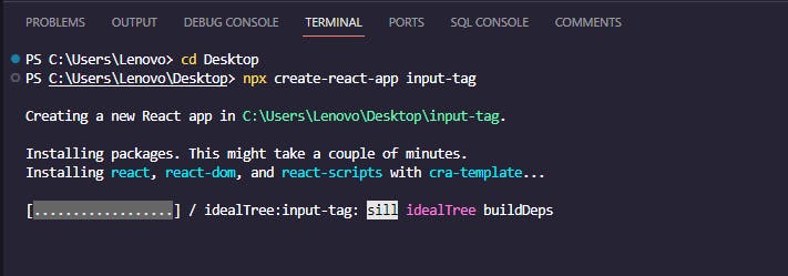
Set up your React project in the Visual Studio code editor by navigating to your selected directory and using the following command:
npx create-react-app input-tag
Following the completion of the process of creating the project, open the project folder in Visual Studio Code by utilizing the following command, and then navigate inside it:
code .
cd input-tag
Step 2: Install the react-tag-input package
Run the following command while inside the projects folder to install the react-tag-input package
npm install react-tag-input
Step 3: Creating input tag component
Now, within the src folder of your project, create a file with the name InputTag.js, into which you will paste the code below.
import React from "react";
import { WithContext as ReactTags } from "react-tag-input";

// specifies which characters should terminate tags input. An array of character codes.
const KeyCodes = {
  comma: 188,
  enter: 13,
};

const delimiters = [KeyCodes.comma, KeyCodes.enter];

const InputTag = () => {
  const [tags, setTags] = React.useState([]);

  // Method to delete tag from Array
  const handleDelete = (i) => {
    setTags(tags.filter((tag, index) => index !== i));
  };

  // Method to Add tag into Array
  const handleAddition = (tag) => {
    setTags([...tags, tag]);
  };
  return (
    <div id="tags">
      <ReactTags
        tags={tags}
        delimiters={delimiters}
        handleDelete={handleDelete}
        handleAddition={handleAddition}
        inputFieldPosition="bottom"
        autocomplete
        allowDragDrop={false}
      />
    </div>
  );
};

export default InputTag;
The above code is a React component named InputTag that utilizes the "react-tag-input" library to create a tag input system. It uses the WithContext wrapper from the library to handle tag input events. The component initializes the state using the useState hook to manage an array of tags. Two functions, handleDelete and handleAddition, are defined to respectively remove and add tags to the array, updating the state accordingly. The ReactTags component is then rendered with various props, including the current tags, delimiters to determine when a tag is added, and callbacks to handle tag deletion and addition. Additionally, specific configurations such as input field position, autocomplete, and drag-and-drop functionality are set within the ReactTags component. This code provides a simple yet functional tag input system in React using the "react-tag-input" library.
Step 4: Styling InputTag Component
At this point, we will customise our component to make it more pleasing to the eye. In the App.css file, paste the code that is provided below.
#tags {
  width: 50%;
  margin: 50px auto;
}

#tags .ReactTags__tags {
  position: relative;
  display: flex;
  align-items: center;
  background-color: #e2e2e2;
  padding: 10px;
  border-radius: 8px;
}

#tags .ReactTags__selected {
  display: flex;
}

#tags .ReactTags__clearAll {
  cursor: pointer;
  padding: 12px;
  margin: 12px;
  background: #ff6b6b;
  color: #fff;
  border: none;
  border-radius: 4px;
}

#tags .ReactTags__tagInput {
  border-radius: 4px;
  display: inline-block;
}

#tags .ReactTags__tagInput input.ReactTags__tagInputField,
#tags .ReactTags__tagInput input.ReactTags__tagInputField:focus {
  height: 38px;
  margin: 0;
  font-size: 14px;
  min-width: 180px;
  padding: 0px 12px;
  border: 1px solid #ccc;
  border-radius: 4px;
}

#tags .ReactTags__editInput {
  border-radius: 4px;
}

#tags .ReactTags__editTagInput {
  display: inline-flex;
}

#tags .ReactTags__selected span.ReactTags__tag {
  border: 1px solid #bbb;
  background: #5cb85c;
  color: white;
  font-size: 14px;
  display: flex;
  padding: 8px;
  margin: 0 8px;
  border-radius: 4px;
}

#tags .ReactTags__selected a.ReactTags__remove {
  color: #888;
  margin-left: 8px;
  cursor: pointer;
}

#tags .ReactTags__suggestions {
  position: absolute;
}

#tags .ReactTags__suggestions ul {
  list-style-type: none;
  box-shadow: 0.1em 0.2em 0.5em rgba(0, 0, 0, 0.1);
  background: #fff;
  width: 220px;
  border-radius: 4px;
}

#tags .ReactTags__suggestions li {
  border-bottom: 1px solid #ddd;
  padding: 10px 12px;
  margin: 0;
}

#tags .ReactTags__suggestions li mark {
  text-decoration: underline;
  background: none;
  font-weight: 600;
}

#tags .ReactTags__suggestions ul li.ReactTags__activeSuggestion {
  background: #a4c2f4;
  cursor: pointer;
}

#tags .ReactTags__remove {
  border: none;
  cursor: pointer;
  background: none;
  color: white;
  margin-left: 8px;
}

#tags input {
  background-color: #e2e2e2;
  border: 1px solid #ccc;
  border-radius: 4px;
  padding: 10px;
  font-size: 14px;
  color: #333;
}

#tags input:before {
  border: none;
}
Step 5: Integrating InputTag in the app.js
Now, add the InputTag component to your App.js file.
import "./App.css";
import InputTag from "./InputTag";

function App() {
 return (
   <div className="App">
     <InputTag />
   </div>
 );
}

export default App;
Step 6: Running the application
The application can be viewed in the browser after it has been executed by using the following command.
npm start
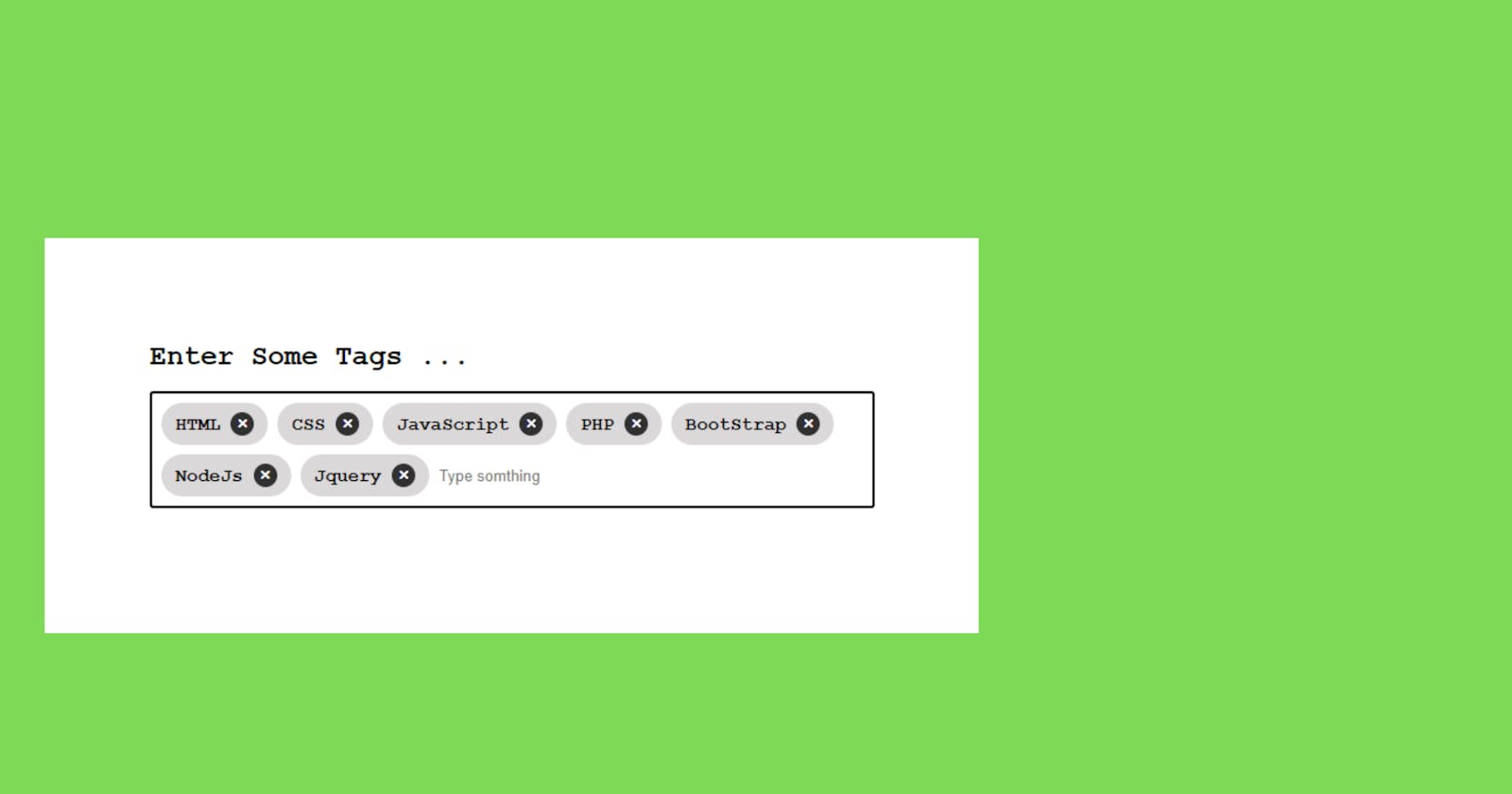
As you can see, we successfully built a tag input system using React.
Conclusion
In wrapping up this guide on crafting a tag input system with React JS, we've navigated through a series of practical steps aimed at empowering web developers in their React journey. By breaking down fundamental concepts like state management and event handling, and seamlessly integrating a third-party library, you now possess the tools to implement an efficient and interactive tag input component. Overcoming challenges in documentation interpretation and CSS styling reflects the real-world problem-solving skills that developers often encounter. Consider this guide not just as a tutorial but as a companion in your React development endeavours, offering a hands-on approach to building a feature-rich tag input system for your web applications.