


Introduction
Web applications revolve around account management, which allows users to access, interact with, and customize their digital experiences. An efficient account manager is critical for guaranteeing a safe and smooth user experience, whether it's getting access to unique content, protecting personal data, or customizing preferences. Improving user authentication, streamlining navigation, and laying a solid groundwork for personalized interactions within web apps are some of the topics covered in this article as it dives into the complexities of building an account manager using React Router DOM. Come along as we explore what goes into making an account management system that is both user-friendly and dynamic.
Importance of React Router DOM for navigation
React Router DOM is a vital library for React application navigation. Here are several reasons React Router DOM is crucial for navigation:
Declarative Routing: React Router DOM lets developers define application navigation using components like Route and Link. Declarative coding improves readability and maintainability.
The module supports React's philosophy by enabling component-based routing. Each route represents a React component, facilitating code modularization and structure.
For complicated applications like account managers, React Router DOM allows hierarchical routing. This functionality lets you organize account views and sections hierarchically.
The React Router DOM simplifies the extraction of URL parameters and the management of dynamic data in the application. This is necessary for user account management and URL-based information display.
The library allows developers to guide users based on specific conditions or activities. This helps implement user authentication and account management operations.
In React Router DOM, navigation functions mirror standard browser behavior. It makes forward and backward navigation easy and smooth.
Integration with React Ecosystem: React Router DOM works flawlessly with other React frameworks and tools. Compatibility enables a seamless development experience and lets developers use the React ecosystem.
Setting Up the Project
Installing React Router DOM
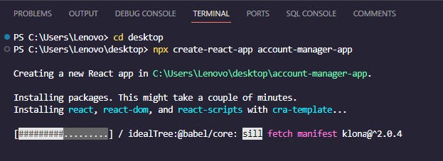
Open the Visual Studio code editor and run the following command on the terminal to create a new React app. account-manager-app is the name of the application.
npx create-react-app account-manager-app
Navigate to our app directory
cd account-manager-app
To launch our React app in VS Code, type the following command while in the directory:.
code .
Let's install the dependencies we need. For instructions on how to configure tailwind CSS, check here
npm install react-router-dom
npm install -D tailwindcss
npm install react-icons --save
Run the application to make sure everything is working well.
npm start
The picture below shows our app running well.

Project structure and organization
In the src folder, create components folder and in it, create Sidebar.js file

Add this code to the sidebar. js: A responsive sidebar with user information and navigation links is defined by this React component. We use Tailwind CSS styles, FontAwesome icons, and custom pictures to dynamically render links with sub-items (changing colors and styles based on conditions).
import React from 'react';
import { FaBitbucket, FaRegUser } from 'react-icons/fa';
import { CiCreditCard1, CiHeart, CiLogout } from 'react-icons/ci';

const Sidebar = () => {
  return (
    <aside className="hidden lg:block w-64 bg-gray-900 text-white p-4">
      <div className="border-b border-gray-700 py-5">
        <div className="flex items-center">
          <img
            width="40px"
            height="40px"
            className="rounded-full object-cover mr-3"
            src="https://i.imgur.com/m79BpQy.jpg"
            alt="Red woman portrait"
          />
          <div>
            <p className="text-gray-500 text-sm">Hello,</p>
            <p className="font-bold">alice</p>
          </div>
        </div>
      </div>
      {sidebarItems.map((item, index) => (
        <div key={index} className="flex border-b py-4">
          <div className="flex w-full">
            <div className="flex flex-col gap-2">
              {item.subItems ? (
                <div>
                  <a
                    href={item.link}
                    className={`flex items-center gap-2 font-medium ${
                      item.icon ? 'text-yellow-400' : ''
                    } ${index === 0 ? 'text-blue-500' : 'text-gray-400'} hover:text-yellow-400`}
                  >
                    {item.icon && item.icon}
                    {item.text}
                  </a>
                  <div className="ml-8 flex flex-col gap-2">
                    {item.subItems.map((subItem, subIndex) => (
                      <a
                        key={subIndex}
                        href={subItem.link}
                        className="text-gray-500 hover:text-yellow-400"
                      >
                        {subItem.text}
                      </a>
                    ))}
                  </div>
                </div>
              ) : (
                <a
                  href={item.link}
                  className={`flex items-center gap-2 font-medium ${
                    item.icon ? 'text-yellow-400' : ''
                  } ${index === 0 ? 'text-blue-500' : 'text-gray-400'} hover:text-yellow-400`}
                >
                  {item.icon && item.icon}
                  {item.text}
                </a>
              )}
            </div>
          </div>
        </div>
      ))}
    </aside>
  );
};

export default Sidebar;
In the components folder, create another file and name it Account.js.
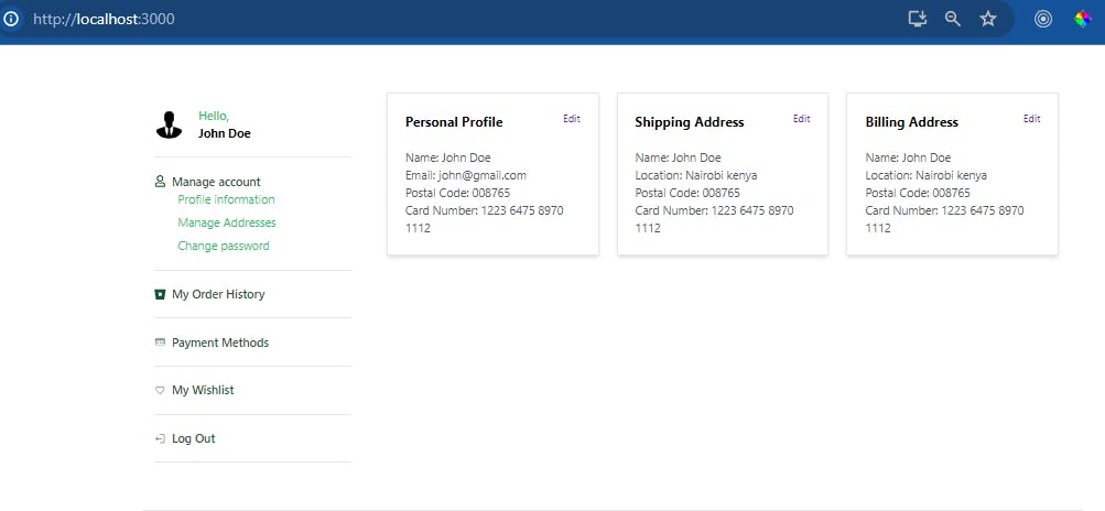
The following React component illustrates an account page with sidebar navigation and choice cards for profile, shipping, and billing address management. Users can access and change their account information by dynamically rendering account choices and fields. A sidebar for navigation and grid-based choice cards make the responsive layout work on small and large screens. Insert it into Account.js.
import React from 'react';
import SideBar from './Sidebar';

const accountOptions = [
  {
    title: 'Personal Profile',
    link: 'profile-information',
    fields: [
      { label: 'Name', value: 'Sarah Johnson' },
      { label: 'Email', value: 'sarah@yandex.com' },
      { label: 'Postal Code', value: '20371' },
      { label: 'Card Number', value: '1223 3432 3344 0082' },
    ],
  },
  {
    title: 'Shipping Address',
    link: 'manage-adresse',
    fields: [
      { label: 'Name', value: 'Sarah Johnson' },
      { label: 'Location', value: 'Belgrade, Serbia' },
      { label: 'Postal Code', value: '20371' },
      { label: 'Card Number', value: '1223 3432 3344 0082' },
    ],
  },
  {
    title: 'Billing Address',
    link: '#',
    fields: [
      { label: 'Name', value: 'Sarah Johnson' },
      { label: 'Location', value: 'Belgrade, Serbia' },
      { label: 'Postal Code', value: '20371' },
      { label: 'Card Number', value: '1223 3432 3344 0082' },
    ],
  },
];

const Account = () => {
  return (
    <section className="container mx-auto w-full flex-grow max-w-screen-xl border-b py-8 lg:flex lg:flex-row lg:py-16">
    {/* sidebar */}
    <SideBar />
    {/* /sidebar */}
    {/* option cards */}
    <div className="mb-8 flex items-center justify-between px-8 md:hidden">
      <div className="flex gap-3">
        <div className="py-5">
          <div className="flex items-center">
            <img
              width="48px"
              height="48px"
              className="rounded-full object-cover"
              src="https://raw.githubusercontent.com/bbulakh/tailwind-ecommerce/2.x/src/assets/images/avatar-photo.png"
              alt="Red woman portrait"
            />
            <div className="ml-5">
              <p className="font-medium text-gray-600 text-lg">Hello,</p>
              <p className="font-bold">Sarah Johnson</p>
            </div>
          </div>
        </div>
      </div>
      <div className="flex gap-3">
        <button className="border bg-amber-400 py-2 px-3 rounded">
          Profile settings
        </button>
      </div>
    </div>
    <section className="grid w-full max-w-screen-xl grid-cols-1 gap-6 px-8 pb-16 lg:grid-cols-3">
      {accountOptions.map((option, index) => (
        <div key={index} className="">
          <div className="border py-6 shadow-md">
            <div className="flex justify-between px-6 pb-6">
              <p className="font-bold text-lg">{option.title}</p>
              <a className="text-sm text-purple-800" href={option.link}>
                Edit
              </a>
            </div>
            <div className="px-6">
              {option.fields.map((field, fieldIndex) => (
                <p key={fieldIndex} className="text-gray-600">
                  {field.label}: {field.value}
                </p>
              ))}
            </div>
          </div>
        </div>
      ))}
    </section>
  </section>

  );
};

export default Account;
In the components folder, create another file and call it Adresse.js.
The following React component, "ManageAdresse," manages address information. It has a sidebar for navigation and a form for updating the nation, city, and zip code. The form is responsive and has validation indicators and a save button. Put it in the Adresse.js file.
import Sidebar from './Sidebar';

const ManageAdresse = () => {
  return (
    <section className="container flex-grow mx-auto max-w-screen-xl border-b py-8 lg:flex lg:flex-row lg:py-16">
  <Sidebar />
  <section className="grid w-full max-w-screen-xl grid-cols-1 gap-6 px-8 pb-16">
    <div className="py-6">
      <div className="w-full" />
      <form className="flex w-full flex-col gap-4" action="">
        <div className="flex w-full flex-col">
          <label className="flex items-center text-gray-600" htmlFor="country">
            Country
            <span className="block text-sm font-medium text-red-500 ml-1">*</span>
          </label>
          <input
            className="w-full border px-4 py-2 lg:w-1/2"
            type="text"
            placeholder="Serbia"
          />
        </div>
        <div className="flex w-full flex-col">
          <label className="flex items-center text-gray-600" htmlFor="city">
            City
            <span className="block text-sm font-medium text-red-500 ml-1">*</span>
          </label>
          <input
            className="w-full border px-4 py-2 lg:w-1/2"
            type="text"
            placeholder="Belgrade"
          />
        </div>
        <div className="flex flex-col">
          <label className="text-gray-600" htmlFor="zipCode">Zip Code</label>
          <input
            x-mask={999999}
            className="w-full border px-4 py-2 lg:w-1/2"
            placeholder={240116}
          />
        </div>
        <button className="mt-4 w-40 bg-violet-900 px-4 py-2 text-white">
          Save changes
        </button>
      </form>
    </div>
  </section>
</section>

  );
};

export default ManageAdresse;
The next step is to proceed by making a new file called ChangePassword.js in the components folder.
Users can change their password on the ChangePassword page. It has a sidebar for navigation and a form area with fields for the current password, the new password, and the new password again. Visual cues on the form include labels that show which fields are needed and a button that lets you save your changes.
import Sidebar from './Sidebar';

const ChangePassword = () => {
  return (
    <section className="container mx-auto flex-grow max-w-screen-xl border-b py-8 lg:flex lg:flex-row lg:py-16">
    <Sidebar />
    <section className="grid w-full max-w-screen-xl grid-cols-1 gap-6 px-8 pb-16">
      <div className="py-6">
        <div className="w-full" />
        <form className="flex w-full flex-col gap-4" action="">
          <div className="flex w-full flex-col">
            <label className="flex items-center text-gray-600" htmlFor="currentPassword">
              Current Password
              <span className="block text-sm font-medium text-red-500 ml-1">*</span>
            </label>
            <input
              className="w-full border px-4 py-2 lg:w-1/2"
              type="password"
              placeholder=""
            />
          </div>
          <div className="flex w-full flex-col">
            <label className="flex items-center text-gray-600" htmlFor="newPassword">
              New Password
              <span className="block text-sm font-medium text-red-500 ml-1">*</span>
            </label>
            <input
              className="w-full border px-4 py-2 lg:w-1/2"
              type="password"
              placeholder=""
            />
          </div>
          <div className="flex flex-col">
            <label className="flex items-center text-gray-600" htmlFor="repeatNewPassword">
              Repeat New Password
              <span className="block text-sm font-medium text-red-500 ml-1">*</span>
            </label>
            <input
              className="w-full border px-4 py-2 lg:w-1/2"
              type="password"
              placeholder=""
            />
          </div>
          <button className="mt-4 w-40 bg-violet-900 px-4 py-2 text-white">
            Save Changes
          </button>
        </form>
      </div>
    </section>
  </section>

  );
};

export default ChangePassword;
We will now make the last component, which is called profile. Make a file in the components folder and name it Profile.js.
The Profile React component displays a user profile page with an avatar image, editable first, last, and bio fields, and a "Save changes" button.
import SideBar from './Sidebar';

const Profile = () => {
  return (
    <section className="container flex-grow mx-auto max-w-[1200px] border-b py-5 lg:flex lg:flex-row lg:py-10">
    <SideBar />
    <section className="grid w-full max-w-[1200px] grid-cols-1 gap-3 px-5 pb-10">
      <div className="py-5">
        <div className="w-full">
          <h2 className="text-2xl font-bold mb-4">Avatar image</h2>
          <div className="mx-auto mb-5 flex flex-row items-center bg-neutral-100 py-5 lg:mx-0 lg:w-1/2">
            <img
              className="ml-5 h-20 w-20 rounded-full"
              src="https://imgur.com/JdFbwHZ"
              alt="John Doe"
            />
            <form>
              <div>
                <label className="block">
                  <span className="sr-only">Choose profile photo</span>
                  <input
                    type="file"
                    className="mx-auto ml-5 flex w-full justify-center border-yellow-400 text-sm outline-none file:mr-4 file:bg-amber-400 file:py-2 file:px-4 file:text-sm file:font-semibold"
                  />
                </label>
              </div>
            </form>
          </div>
        </div>
        <form className="flex w-full flex-col gap-3" action="">
          <div className="flex w-full flex-col">
            <label className="flex" htmlFor="name">
              First Name
              <span className="block text-sm font-medium text-slate-700 after:ml-0.5 after:text-red-500 after:content-['*']" />
            </label>
            <input
              className="w-full border px-4 py-2 lg:w-1/2"
              type="text"
              placeholder="Sarah"
            />
          </div>
          <div className="flex w-full flex-col">
            <label className="flex" htmlFor="name">
              Last Name
              <span className="block text-sm font-medium text-slate-700 after:ml-0.5 after:text-red-500 after:content-['*']" />
            </label>
            <input
              className="w-full border px-4 py-2 lg:w-1/2"
              type="text"
              placeholder="Johnson"
            />
          </div>
          <div className="flex flex-col">
            <label htmlFor="">Bio</label>
            <textarea
              className="w-full border px-4 py-2 text-gray-500 outline-none lg:w-1/2"
              name=""
              id=""
              cols={30}
              rows={10}
              defaultValue={'  CEO, MayBell Inc.'}
            />
            <button className="mt-4 w-40 bg-violet-900 px-4 py-2 text-white">
              Save changes
            </button>
          </div>
        </form>
      </div>
    </section>
    {/* /form  */}
  </section>

  );
};

export default Profile;
Lastly, update the App.jsx file with the following code: This code creates React Router routes for Account, Profile, ManageAdresse, and ChangePassword in a React BrowserRouter.
import './App.css';

import { BrowserRouter, Routes, Route } from 'react-router-dom';
import Profile from './components/Profile';
import Account from './components/Account';
import Adresse from './components/Adresse';
import ChangePassword from './components/ChangePassword';
export default function App() {
  return (
    <BrowserRouter>
      <Routes>
        <Route path="/" element={<Account />}></Route>
        <Route path="/profile-information" element={<Profile />}></Route>{' '}
        <Route path="/manage-adresse" element={<Adresse />}></Route>
        <Route path="/change-password" element={<ChangePassword />}></Route>
      </Routes>
    </BrowserRouter>
  );
}
Run the application using the following command:
npm start
We have successfully constructed a multi-page account manager using React Router, which is fully responsive, as shown in the images below.

Conclusion
We built an Account Manager app using the React Router DOM in this post. We demonstrated the organization of routes and components for seamless navigation by covering major components such as Profile, Account, Manage Address, and Change Password.
As you go on with your Account Manager development, think about adding more complex functionalities, investigating more style possibilities, and researching new features. With React Router DOM as your base, you can build a robust navigation system and modify the app to fit your needs. In order to build a powerful yet intuitive account management system, you need to keep trying new things and honing your abilities. Have fun with the code!